WE'LL COME TO YOU.

Since we aren't on every social media site, let us come to you. Enter your email below and we'll send you our monthly handwritten newsletter. It will be written during the hours of moonrise, and include featured posts, wild tangents, and rowdy stick figures. 

Keep the beautiful pen busy.


Brooklyn, NY
USA

Handwritten is a place and space for pen and paper. We showcase things in handwriting, but also on handwriting. And so, you'll see dated letters and distant postcards alongside recent studies and typed stories. 

HW Blog

search for me

Filtering by Tag: Sarah Madges

Handwriting Continues to Prove Its Nimble Nature • A Conversation with Curator of Manuscripts at Mary Savig

Bretty Rawson

"Technologies of communication, from telegrams to texting, have long threatened the written word. And yet, handwriting continues to prove its nimble nature. The craft of handwriting has flourished online, especially on social media. Artists, thinkers, and makers alike are experimenting with penmanship in innovative ways. Along these lines, the Archives continues to digitize and make our vast handwritten records available online for new generations to discover."

Read More

Pen to Paper: Artists' Handwritten Letters • A Review by Sarah Madges

Bretty Rawson

"Designed by Princeton Architectural Press, the book operates much like a gallery exhibition, privileging the visual over the verbal so that we may take in the high quality images as art objects before reading the accompanying “wall text” that complements and situates them."

Read More

2/19 Conceptual Poetry Panel at Pen + Brush, Hosted by Sarah Madges

Bretty Rawson

Conceptual Poetry: Practice, Production, & Reception
Friday, February 19 | 7:30-9:00pm
Pen + Brush gallery, 29 E 22nd St.

We at Handwritten like to look at creative production holisticallyfeaturing a series of drafts and the overall creative process, rather than simply publishing the final work with no evidence of its becoming. In that sense, conceptual poetry is a kindred spirit, a literary movement that focuses more on the initial concept than the final product of the poem, and that often appropriates found materials to create new works. 

Join us at Pen + Brush for a panel session devoted to conceptual poetry's special possibilities, and the ramifications of these possibilities. Sarah Madges, chief curator at Handwritten, has brought together five poets and scholars to discuss issues such as: what strategies or conceits constitute a conceptual gesture,the role of both author and reader when a text isn't quite "authored" or "readable" in the usual sense, conceptual approaches one might adapt to other genres or artforms as well as its hybrid and performative nature, the use of algorithms and coding in poetry production, and interrogating what we mean by the "conceptual" itselflooking especially at female writers of color for alternative understandings and definitions. 

The roster includes: Sarah Madges (moderator), Evie Shockley, LB Thompson, Elizabeth Guthrie, LaTasha Diggs, Buffy Cain, and Holly Melgard. Moderated by Sarah Madges, with a Q&A to follow the presentations. Bios for our panelists to come very soon. 

Did we mention there will be wine?

We hope to see you on Friday, February 19th.

I See Students Who Crave the Opportunity to Work with Their Hands • A Conversation With Gail Anderson

Bretty Rawson

Portrait of Gail Anderson, by Paul Davis

Portrait of Gail Anderson, by Paul Davis

BY SARAH MADGES

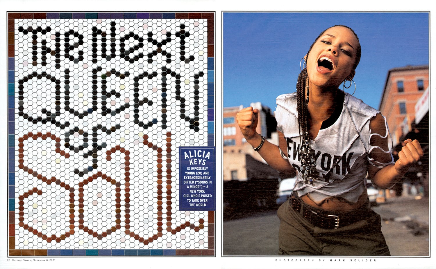
With decades of teaching, typography, and creative collaboration under her belt, New York-based designer and writer Gail Anderson has a CV worth calling home about — at least, it earned her the holy grail of graphic design achievements, the AIGA medal, in 2008. The design-ecstatic aesthete made her first layout years before her tenure as art director at Rolling Stone, literally cutting and pasting a magazine mockup of the Jackson Five in her childhood bedroom.

She’s been busy ever since, developing identity campaigns for Broadway shows, co-writing typography books with Steven Heller, teaching type fundamentals in the MFA program at SVA, and co-partnering with Joe Newton at their eponymous Anderson Newton Design firm for projects ranging from book jackets to outdoor installations. Despite the ease and efficiency of digital design technology, Anderson swears by taking time to untether from the laptop, insisting that craft is crucial to typography, and slowing down with a pencil and piece of paper is crucial to honing that craft. In November we reviewed her latest book, Outside the Box, which honors this DIY by-hand approach, following the hand-lettering trend from its individual, artful beginnings to its contemporary commercial ubiquity.

I had the chance to talk to her about the book’s composition, as well as handwriting and hand-lettering in general — how it plays into her life as a designer, and design as a whole. 

Childhood Sketchpad

Childhood Sketchpad

Design inspiration from childhood, 1974

Design inspiration from childhood, 1974

SARAH MADGES: What role does the pen and notebook play in your life?

GAIL ANDERSON: I’ve grown increasingly particular about the pens and notebooks I use, since I really enjoy the physical act of writing. I’m a fan of black Pilot Varsity fountain pens and Pilot Precise V7s. And I was extremely loyal to those Japanese Oh Boy notebooks with the thick, ruled paper, even after Chronicle acquired them and put the Oh Boy logo on the front. I have two left that I’m saving for God knows what since they’re now out of production. I moved on to Muji, and then Moleskine, and am now working my way through some Field Notes steno pads. I even keep a paper date book, so clearly the art of writing still means a lot — possibly way too much — to me. 

MADGES: You divided your book into four sections — DIY, art, craft, and artisanal. How did you come up with these four categories? Was it always clear you were going to organize the book this way? 

ANDERSON: I knew I wanted to have some kind of system to categorize the material. I’ve learned a lot from working with Steve Heller for so many years, so I did what we always do with our books — I spread the work out with someone I trust and we let it sort of organize itself. It’s too confining to categorize stuff in the research stage, but you can’t wait till the design stage either. It was really fun to come up with section titles, and once my design partner, Joe Newton, and I got through that process, I felt like we had the contents of a real book in front of us.

Type Spread from Outside the Box.

Type Spread from Outside the Box.

MADGES: Do you see a significant difference between what’s considered handwriting and hand-lettering? How would you define the difference — is it intent? Actual artistic design and effort?

ANDERSON: I wrote out Debbie Millman’s foreword by hand and consider that to be handwriting rather than hand-lettering. When I look at it now, though, it seems so deliberate (and some folks have assumed it was a font). Maybe it does have something to do with intent — I’m not quite sure where the line in the sand is.

Broadway theater poster designed at SpotCo

MADGES: Why do you think people respond to hand-drawn lettering? Do you think there will always be a demand for it? Do you imagine it will lose popularity any time soon?

ANDERSON: People connect to branding and advertising that feels intimate and artisanal. It’s somehow less “corporate," even though hand-drawn type is used by just about everyone now. I think Andrew Gibbs from the Dieline said it best in the book’s intro: “In all my years of seeing packaging trends come and go, there is one style that has stood the ultimate test of time: hand-drawn.” I admit that a few years ago, I thought, “Well, how long will this last before we swing all the way back to Helvetica?” But in some form or another, hand-drawn type is here to stay. 

Type Directors Club letterpress post card

Type Directors Club letterpress post card

MADGES: Do you see a similar resurgence in classic or vintage fonts in reaction to the digital age?

ANDERSON: I see students who crave the opportunity to work with their hands — kids who’ve pretty much grown up in front of a computer. While embracing technology is key to their success as designers, they don’t want to feel tied to their laptops. We did a hand-lettering class last week and the students actually started applauding at the end — that’s how hungry they are. And I think they are beginning to seek out classic and vintage fonts, which is such a relief after so many years of all those awful free fonts. 

MADGES: Is there a distinct moment or brand that signaled the beginning of the hand-drawn movement’s resurgence? Or was this a gradual, inevitable change in response to an increase in digital and technological saturation?

ANDERSON: I wasn’t plugged in enough to recognize a particular moment, but it certainly seemed like everyone started drawing — and posting — around the same time. I think it’s all about Pinterest and the other sites and blogs where designers started strutting their stuff publicly. It sometimes felt like everyone jumped on the bandwagon without adding a new twist, but the best of the best have carved out their own niches. And yes, I do believe that it was a reaction to technological saturation and the desire to create something seemingly personal and unique.

Jackson Five scrapbook, 1972

Jackson Five scrapbook, 1972

MADGES: What first compelled you to typographic design? When did you first start collecting typefaces and fonts?

ANDERSON: I started designing magazine layouts as a child, first for The Jackson Five, and then for The Partridge Family. Even then, my pages were filled with my 12-year old version of typography, which was based on Spec and 16 magazines and their Letraset rub-down type. I started saving photostats of typefaces in college, but things really clicked when I worked at Rolling Stone with Fred Woodward. His good taste and sharp eye were instrumental to the growth of my own skills.

MADGES: Marketing research has found that the first piece of mail someone is likely to open has a handwritten address. Do you think this is because of handwriting’s scarcity that it’s perceived as more valuable? Is it more authentic? Personal?

ANDERSON: I’m not in a hurry to open anything that’s got a bulk rate stamp or a mailing label (I hate them on greeting cards). But I’ll give something that has a handwritten address on it a chance, though admittedly I’ve been fooled once or twice by handwriting fonts. I appreciate the idea of someone taking a few minutes to put pen to paper.

Hand-drawn lettering from a cross-stitch book that continues to inspire Anderson

Hand-drawn lettering from a cross-stitch book that continues to inspire Anderson

Outside the Box: Hand-Drawn Packaging from Around the World

Outside the Box: Hand-Drawn Packaging from Around the World

MADGES: You note in your book that hand-drawn lettering isn’t necessarily popular just because of the attendant sense of nostalgia, but rather because of its established historic design technique. What makes this technique more or less difficult to execute? What are the pros and cons?

ANDERSON: Drawing naive type is one thing—and often not as easy as it looks—but doing what Martin Schmetzer, for example, does just blows me away. There’s a tremendous degree of patience and utter stillness required, but there’s also a touch of genius that is at a whole other level. When I was editing through book images, there were times when I’d just stop in my tracks to stare at pencil sketches that were so incredible that they might as well have been finished pieces. And Martin thought his sketches were “rough”—seriously.  

MADGES: I’m similarly amazed that a brand as huge as Chipotle uses handlettering. Do you think it is feasible for any even larger companies to follow that approach? How do you think consumers would respond if McDonalds rebranded with letterpress?

ANDERSON: The idea of a McDonald's “artisan” chicken sandwich rings about as true as the idea of a company like that rebranding with letterpress. But Chipotle’s pretty huge and their incredibly inviting branding brought in a lot of customers, including me. Hatch Show Print does McDonald’s! Ha.

New “Make it Here” SVA poster

New “Make it Here” SVA poster

MADGES: What does it mean for design and typography that the next generation might not be able to read cursive because it is no longer taught in schools?

ANDERSON: I guess we’ll see a lot more child-like lettering that isn’t an affectation! I see my nieces’ and nephews’ handwriting and it’s just terrifying. But I am a product of Catholic schools in the 1970s, where penmanship was paramount. On the other hand, I also see young designers who can make letterforms into magic on their computers, so perhaps it all evens out. As long as there are cursive typefaces to buy, they’ll just have to learn to read script even if they can’t write it.

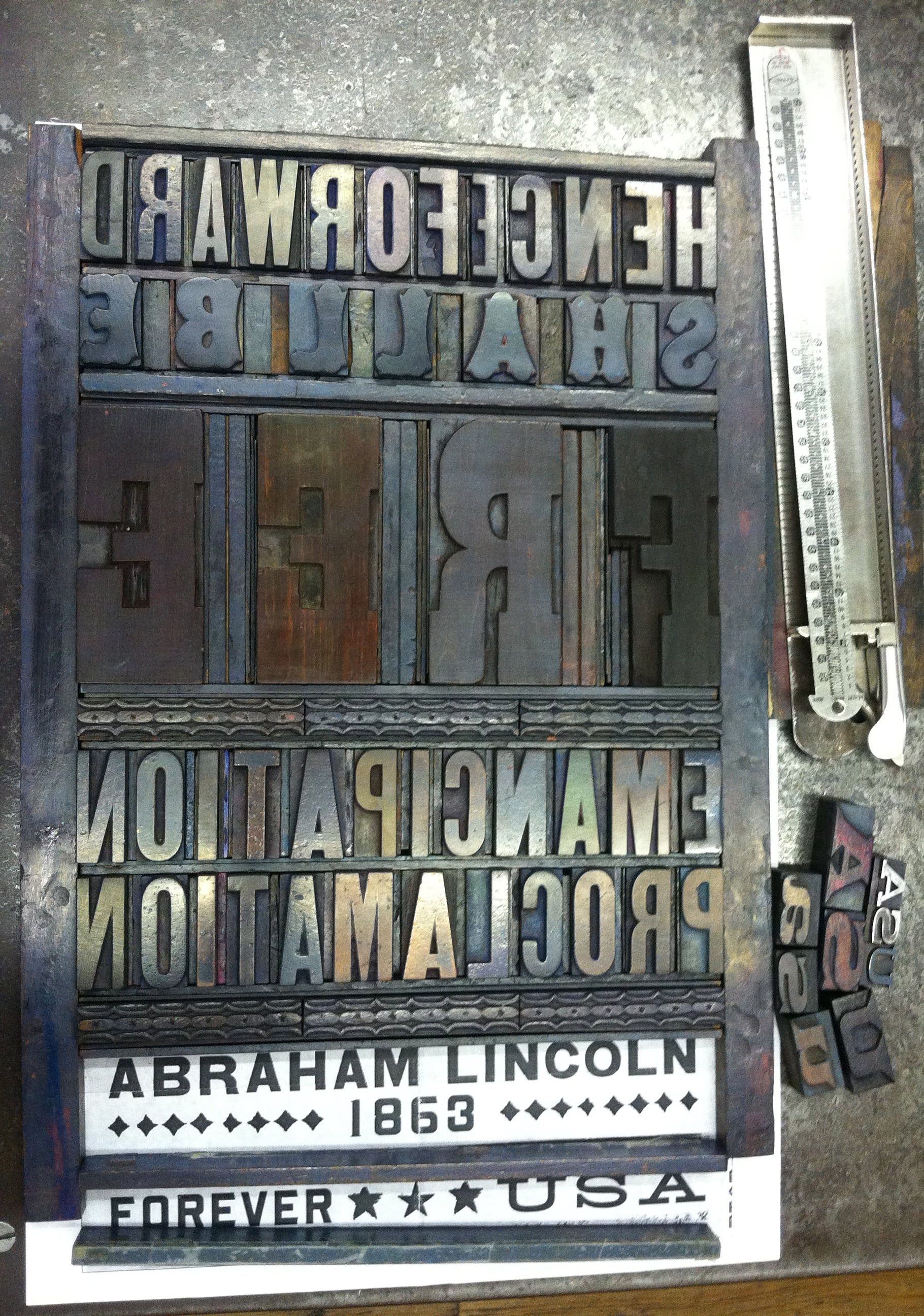
MADGES: Looking at your site, I’m impressed that you are an incredibly versatile and prolific designer. You’ve worked as Art Director at Rolling Stone, an educator at SVA, are on the board of TDC, you designed probably my favorite US Postal stamp — the Emancipation Proclamation. How do you take on these projects — what strings them together? And what’s next?

ANDERSON: I actually just started a new job recently that should keep me challenged for a good long time. I’m now the Director of Design and Digital Media at Visual Arts Press (SVA). My career is tied to a love of working with words, whether it’s designing them or writing them. The Emancipation Proclamation stamp may be my all-time favorite project. I got to design using a piece of history — the first words from the document itself, and was able to set the actual type at Hatch and watch Jim Sherraden print the poster that was then reduced to stamp size. It doesn’t get better than that.

The Best Investment of Time and Money • A Conversation with Calligrapher Kathy Orf

Bretty Rawson

BY SARAH MADGES

Kathy Orf is a calligrapher living and creating in St. Louis, MO. She has been practicing a “morning writing” ritual in which she sits down and draws in calligraphy without any prior planning for just a few minutes each day, a 365 project that allows her to continually approach her work in fresh ways. I had the chance to talk to her about what exactly calligraphy is, how it relates to handwriting, and how she became so invested in the art.

black_ink.png

SARAH MADGES: How and when did you first become interested in calligraphy? How did you come to make a career out of it?

KATHY ORF: I had a “decorative arts” class in high school that included calligraphy and — I’m really dating myself here — macramé! Then in college, I majored in graphic design and had a whole semester of calligraphy, which was really rare. After graduation, I worked in graphic design until my second son (Alex) was born and then decided I should stay home and do calligraphy part time. I had started trying to sell my work at arts and crafts shows just 3 months after my first son was born and thought I would continue that. I’m not sure I would call it a “career,” maybe more of a passion or a creative outlet…It is really hard to support yourself doing calligraphy and luckily I never had to. That said, I’ve been doing calligraphy for 30 years.

MADGES: When people hear the word calligraphy, they tend to think “beautifully ornate handwriting” or “wedding invitations.” How do you characterize calligraphy — is it an art form, a process of symbol arrangement, pimped-out handwriting? What are calligraphy’s essential elements? What makes it different from handwriting?

ORF: I think calligraphy can be different things depending on how it is used. It can definitely be an art form…something which has been a struggle to achieve in other’s eyes. But it can be very utilitarian when it is used to address envelopes or fill in names on pre-printed certificates. I do not consider calligraphy to be hand-writing in any sense of the word. It takes years of practice and good instruction and some talent to reach a certain skill level. Calligraphy is not fast in learning it or its execution. The letters may look like they’ve been written quickly, but many times it is more deliberate than you might think. And the funny thing is, one important part of hand-lettering is consistency, but whenever I look at printed lettering, I look to see if the letters are identical to determine whether it is hand-done or a typeface. So, even though you strive for consistency, you also want it to look organic, like it came from someone’s hand and not a machine.

MADGES: Does your handwriting resemble your calligraphy? Have you always had good handwriting?

ORF: My handwriting is the worst…just ask my husband. But I think it is because I am always in a hurry when I am writing something and using a ballpoint pen. Put a calligraphy nib in my hand and it’s a different story. It’s almost like my hand knows what to do at that point.

MADGES: Do you have one main mode of calligraphy, or are you always inventing and adapting the letters and symbols to their specific purpose and environment?

ORF: I know many different hands…italic, uncial, blackletter, foundational, romans, copperplate…and variations of them all. But I tend to get in ruts and use the same personalized style all of the time. I guess you could call this style my “calligraphic handwriting” because that is what I use to write with most of the time.  My tool of choice to create this lettering is a pointed pen…Brause EF66. It is very flexible and can be used to write very tiny or even letters up to an inch tall. Every morning, I pick up my Brause, a piece of paper that I had already painted and just write a saying using this “handwriting,” although it does not resemble my actual handwriting at all. But, when I sit down to do a finished piece, I might think more about what I want it to look like, and what style I should use, and even use a chiseled nib, like a Mitchell.

MADGES: What are your most common assignments — and what kind of clients do you attract? How long do you spend working on individual pieces?

ORF: Most of my work of late is just doing sayings for friends. I don’t advertise, except through word of mouth. I have some certificate work for Washington University in the spring and fall, and will do a wedding or two a year, but usually just for friends, as I’ve never really enjoyed the rote nature of the work. I also create pieces to sell at fairs using my photographs of things that look like letters that I combine with my calligraphy. I can usually do a simple lettering job in a couple of hours. If I am creating a background and lettering a larger piece, it takes maybe 6 to 8 hours — it really depends on so many variables.

MADGES: What do you think about the diminishment of handwriting and cursive lessons in U.S. schools? Have you noticed any change in the demand for and reception of calligraphy as handwriting diminishes in use and popularity?

ORF: I think it is terrible that they are trying to stop teaching handwriting in schools. I think it is one of those things that they will later decide was detrimental to cognitive development. I’m not sure diminished use of handwriting has affected the popularity of calligraphy as much as the increase in fonts that look like it!

MADGES: What are some of your favorite examples of calligraphy in general — historical, global, etc.?

ORF: I just went to see the Book of Kells this summer at Trinity College in Dublin and it was amazing. I also love the work that Donald Jackson did on the St. John’s Bible that he just completed a couple of years ago for St. John’s Abbey and University in Minnesota. But I am mostly drawn to and excited by contemporary calligraphy.

MADGES: Why do people respond to it? Do you think there will always be a demand or desire for calligraphy?

ORF: I think people respond to calligraphic work because it so often interprets words in a way that touches them. Sometimes it’s because it is something they “wouldn’t have the patience for” — I hear this very often. And sometimes just because it is beautiful! I think there will always be a desire to do calligraphy as art, maybe not as much of a demand for invitations and such, although the whole retro movement may help, like it has for letterpress printing! But to survive, I think it will have to grow more into the realm of art and it has been doing that for a while now.

MADGES: Any advice for calligraphy enthusiasts out there?

ORF: Join your local calligraphy guild. Learn from good teachers and don’t just take a class and never do it again…practice or do homework if it is assigned. The best thing I ever did was to take a year-long class taught by a calligrapher named Reggie Ezell. He travels to four different cities for one weekend of every month of the year teaching almost everything you need to know. The great thing is that there was homework each month, and I DID THE HOMEWORK…and that made all of the difference! Unfortunately, Reggie is retiring after next year. But that was the best investment of time and money I ever spent.

It Starts to Look Like a Timeline, Not a Journal • A Conversation with Angela Flournoy

Bretty Rawson

BY SARAH MADGES

Angela Flournoy and her debut novel, The Turner House, are igniting the literary scene with their unassuming eloquence and nuanced commentary on the deleterious effects of the 2008 housing bubble and the black American diaspora, whose interrelated history subsumes the 13 members of the Turner family as they navigate a crumbling Detroit.

Garnering significant attention and accolades for a debut novelist, Flournoy is a finalist for the National Book Awards in Fiction, and was named a “5 under 35” writer, designations that left Flournoy nearly tweetless, only able to write “whaaaat” in response. Despite this rapid success, when we saw her during an intimate conversation hosted by CLMP at the New School, there was an easygoing magnetism to her speech, posture, and perspective. Although Flournoy is the first to admit her excitement for the book’s positive reception, watching her speak, it seemed clear that we are in the presence of a person who has remained rooted at the center of the spinning wheel. 

So when we found out that Flournoy wrote the entire first draft of The Turner House by hand, we went wild with theories — perhaps the handwritten word explains why she is so grounded, or has enabled her to access memories of her father’s Detroit childhood, etc. Thankfully, Sarah Madges from Handwritten spoke with Angela about writing The Turner House by hand, thereby recusing us of the need to go on any longer. We wish Angela the very best this week, and hope everyone who reads this here will read her book, and then handwrite their own.  

SARAH MADGES: So I wanted to talk to you about your process, how handwriting figures into it, and how you came to incorporate it into your process:

ANGELA FLOURNOY: Handwriting has always been a part of my process. I got my first journal when I was eight years old — I don’t have them with me or I’d check, they are at my mother’s house. I’ve always worked out ideas or feelings through handwriting.

For most of my academic life I was writing papers on the computer and generally typing things, and it didn’t seem like the most natural way to work on something that was not like a term paper. When I was first writing short stories in undergrad most were written on a computer first, but when I got to Iowa, one thing that was an issue for me was procrastination. I didn’t have the smartest of phones, I was always a couple generations behind — now that’s an issue — but I figured if I left the house I’d focus more. So I would sit in the coffee shop and sit on my laptop hanging around on the Internet instead of writing, even after downloading Self Control, because you could still override it.

So I returned to handwriting to focus — there were not as many distractions. Especially when you’re working on something historical, you want to look everything up on Google, which is useful in revision, but it gets in the way of writing when you stop and end up in a Wikipedia rabbit hole. Writing longhand made me focus, and slow down. 

MADGES: Has your writing always been historical in the way The Turner House is, or written about, for example, a city you never lived in, but know about? 

FLOURNOY: History is always a part of the way that I envision stories. This novel, especially, but I had written 70 pages of another novel based in a city I never lived in and it was a similar process.

MADGES: How would you get yourself to push through the writing instead of succumbing to the kneejerk reaction to look things up — would you leave notes like “look up later” and just keep going?

FLOURNOY: Well I would put an asterisk next to what I wasn’t sure was right. The thing about literary fiction is that it’s not one of those things — I’m not writing a civil war period piece that heavily relies on research and that people are so into it and will feel betrayed if they feel it’s inaccurately portrayed, like, “That’s not what happened at Gettysburg!” That’s not the burden of the kind of fiction I write. You just need to have a foundation with reality. I would just write in the margin: Look this up!

MADGES: You said you started writing in a journal when you were around eight years old. Did someone encourage you to do that, or did you sort of come to that naturally?

FLOURNOY: Well, it was a Christmas present from an aunt of mine and so then it was just, there. And I’ve always been a person who, as soon as I learned how to read, read a lot, so it was like of course I would do this thing. No one was telling me I have to do it, and there wasn’t much else to do. Now, we live in a time of distraction, so it might be different. People talk about wanting to pick it up as a practice. 

MADGES: Did you always prefer to write by hand? Have you found greater success this way, or did you notice yourself writing/editing differently with a word processor? 

FLOURNOY: I feel like I’m a lot less apt to take risks when I’m typing out a story because it’s so easy to delete things; whereas, when you’re writing by hand you have to get to a certain critical mass before you “x” something out. It’s too easy to reread every sentence, go backwards rather than forward.

The editing process should be the editing process. You handicap yourself when you keep cutting down your own ideas. One on its own might not be great, but they might all make sense in concert with themselves. When there’s that blinking cursor encouraging you to cut them down, you might lose what the idea was really supposed to be. 

MADGES: Right! And once you delete them there’s no evidence of those ideas, at least in a notebook you can usually still read the words you crossed out. So how does handwriting figure into your writing process? What role did it play in writing the Turner House?

FLOURNOY: One benefit of writing longhand, I’m more gentle with myself on first drafts. It hurts to scratch out all the pages you wrote in the day.

I usually write the first draft longhand with notes in the margins and sometimes rudimentary edits as they fit on the page. For this novel, I wrote maybe a couple chapters at a time, then I would go and type them into this master novel document. That’s already two editing processes: on the page in the margins, and then of course I’m not going to transcribe something that is terrible, so again when I type. And because I’m not rereading everything in the document, that document lives separately, it ends up getting sort of built up and I’m able to look at what’s there, what’s working and what’s not, and change it later. It allows me to have a base, and provides some time between writing something and wanting to jump into revising it and moving, structurally, whole chapters around. Once I finished a notebook I would assess: where are we actually in the larger narrative? Some of the notebooks are half writing prose, half notes. It took about seven college ruled Moleskine notebooks. 

MADGES: How long would it take you? Did you find yourself having to stop because you couldn’t physically write anymore, or…?

FLOURNOY: No, I’m not a fast writer. On some days, it might have been more staring and thinking and I maybe only wrote five actual pages in my notebook. On other days, I could very easily look up and there’d be 15 pages in front of me. And even though handwriting is larger, those 15 pages would end up being 20 pages because I would think of things to add or subtract when transcribing. I don’t really remember my hand cramping. I wish I was one of those people who could really get a lot out of writing for three hours every day. For me, I have “writing seasons” and I have “thinking about writing seasons,” and when I am in the writing season, I just hunker down. I wake up early. If I don’t have a block of four hours, I feel like the time is already gone. I am not a fast writer. I was working at a D.C. public library, and I would have a shift from 5-9pm. So I would get to the coffee shop at noon and I would try to finish, or start a chapter. 

MADGES: Do you keep a journal, or carry a notebook and pen around with you? 

FLOURNOY: I have a journal but I don’t write in it much. When I was writing short stories, I would sometimes journal, but when I was writing this novel, I think the last thing I wanted to do was pick up another book and write in that book, too. I have slowed down journaling for myself. Now, I use it more for marking moments, or milestones.  

MADGES: How do you feel about the fact that cursive is no longer required teaching in U.S. elementary schools? 

FLOURNOY: I am terrible at cursive — I have terrible handwriting — but I can read cursive. But say, how can you even read archival documents if you can’t read cursive? You have to trust someone else’s transcription of it. It’s as if you’ve lost a language if you can’t read it for yourself and that is dangerous because people can say that any document says anything. It’s bad enough I only know one language fluently — I can at least read and write in Spanish — but it’s bad enough that most people in the U.S. don’t even have reading proficiency in a second language. But to not even have that proficiency in the language you were raised with? We’re not even going to be a monolingual culture anymore — we’re going to be whatever half of monolingual is.

MADGES: Well, you had a very successful debut! How do you feel about being shortlisted for the National Book Award? Were you surprised?

FLOURNOY: Yes, I was surprised. A sort of big moment for me was being on the long list, because who thinks that’s going to happen? I was in my apartment and I had sorted out my clothes and was going to take them to the laundromat and my phone started vibrating. This is stuff your younger writer self doesn’t dare fantasize about. I never really fantasized about publishing my book in general. It’s been great — it’s opened up all these different opportunities. I’m going to be teaching at The New School in the spring, which is exciting. 

MADGES: Did you write about that in your journal?

FLOURNOY: [laughs] Yes, the last thing I wrote was in, like, August, and then: “I got on the shortlist!” It starts to look like a timeline, not a journal. Baby steps. I’ll get there.

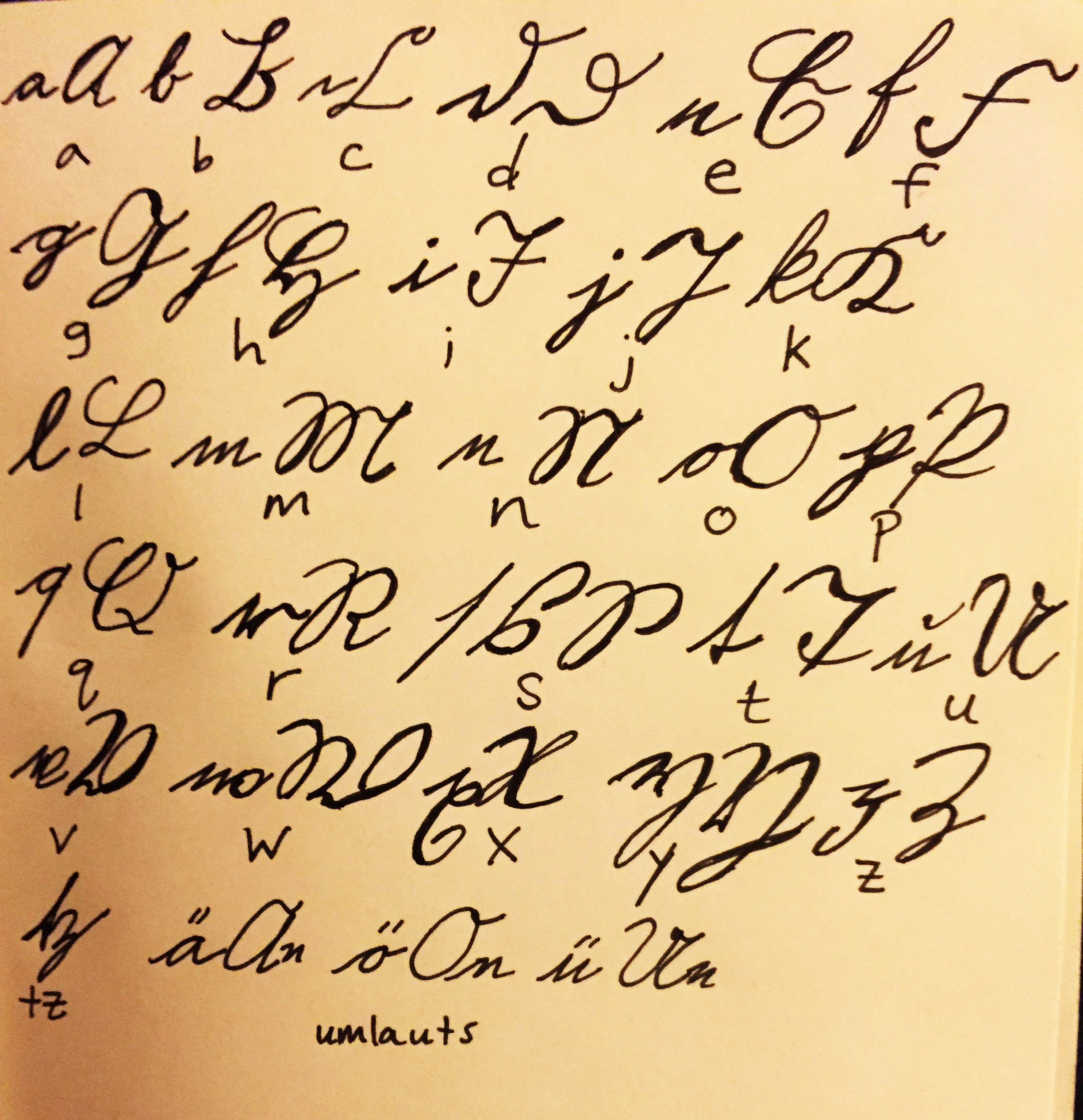
From her site: ANGELA FLOURNOY is the author of The Turner House, which is a finalist for the National Book Award and the Center for Fiction First Novel Prize, a Summer 2015 Barnes & Noble Discover Great New Writers selection, and a New York Times Sunday Book Review Editors' Choice. She is a National Book Foundation "5 Under 35" Honoree for 2015. Her fiction has appeared in The Paris Review, and she has written for The New York Times, The New Republic and The Los Angeles Times.

A graduate of the Iowa Writers' Workshop, Flournoy received her undergraduate degree from the University of Southern California. She has taught at the University of Iowa and The Writer's Foundry at St. Joseph's College in Brooklyn. She is joining the faculty at Southern New Hampshire University's low-residency MFA program in Spring 2016. 

It's So Un-Special, It's Special • A Conversation with the Bill Keaggy on Artfulness, Sloppiness, and Interestingness

Bretty Rawson

St. Louis-based Bill Keaggy is king of “generating content.” A wildly prolific artist and collector, he was an erstwhile magazine designer and photo editor at the St. Louis Dispatch before launching his self-proclaimed purposeless website of “visual indiscretions,” the eponymous www.keaggy.com.

His goal is to make things interesting by helping people appreciate what’s right in front of them—which he more than accomplished with projects such as Milk Eggs Vodka, a tome of anonymous and abandoned grocery lists he first uploaded to his site as a simple photo collection entitled “Grocery Lists,” before piquing a publisher’s interest and organizing them into snarky categories such as “Eating Wrong,” or “Bad Spellrs.”

By compiling such miscellaneous marginalia, Keaggy imbues the ephemeral both with an otherwise lost fixity, and a sort of imaginative narrative history. As he put it, “I considered my work to be ‘art’ in the lowercase form of the term. It’s so un-special, it’s special.” These special un-special projects have been featured in places like the New York Times, The L.A. Times, Chicago Tribune, The Guardian, HOW Magazine, and even Jimmy Kimmel Live. Should you want a more concise and chronologically organized autobiography, his documentary impulse has produced a timeline of his entire life, including everything from his first sip of PBR in 1972 to his NY Times Magazine interview in 2004, here: http://keaggy.com/about-me/.

SARAH MADGES: Have you always been a collector, of marginalia or otherwise?

BILL KEAGGY: I think so. Not in a hoarder kind of way, but yes, I think I’ve always had an interest in collections of things. When I was 10 or so I had a pretty big key chain collection, although now I’m not sure why, but I soon realized that it was far more interesting to collect things that were never meant to be collected. Things that other people had lost interest in or saw as useless. 

MADGES: This project must have required incredible patience and dedication. At any point did you consider quitting? What convinced you to keep going, and to eventually get the collection published in a book?

KEAGGY: The grocery list collection started small and stayed small for a very long time. But I never approached it in a “Must. Add. Lists. Every. Day!” kind of way. I’m not naturally a patient person, but in this case I just let it grow naturally, adding a list every few weeks or so. Then around 2000 I put it online, and back then being a novelty online actually was novel, so it got linked around a lot and people started to ask how they could contribute. Since then, the collection has been fueled 99% by friends and strangers sending me lists. It sort of has a life of its own now and I update the site a few times a year at most. So, no, I never considered quitting because it was difficult. The collection has grown big in the same way people grow old — suddenly you’re not young anymore and you look back and wonder how the hell that happened.

I’d thought about how I might turn it into a book but never acted on it. The truth is that I had the luxury of the publisher contacting me to see if I wanted to make a book. Of course I did. It was a good way to breathe new life into the project, to think about the collection in a different way and give it depth, and help other people think about the lists in different ways.

MADGES: In an increasingly tech- and text-based world, handwriting has lost some of its former relevance and ubiquity — cursive is no longer even required in U.S. school curricula, and thousands of people have never written or received a letter in their entire life. How important is the handwritten aspect of these grocery lists to you? Do you still write by hand?

KEAGGY: The handwritten lists usually are the best — they have more character, personality, quirks, artfulness, sloppiness, and interestingness to them. Not just because of the handwriting but also because of the writing material — you can’t run weird, repurposed scraps of paper or cardboard or magazine through a printer but you can tear a piece off of something and write on it. And I’m a designer so I have this innate interest in letterforms and layout and organization, and everyone brings their own approach to these things in handwritten lists.

That said, I obviously get more and more typed lists now, but fewer lists overall because so many people do keep their lists on their phones. I do, because like everyone else I always have my phone with me. I only occasionally write a grocery list out by hand but the truth is I don’t feel too nostalgic over this change. I still do a lot of writing, sketching, and designing on paper, so it’s still part of my daily life.

MADGES: Many people, editorial reviewers and regular folks (ie, Amazon.com customers) alike, have commented on Milk Egg Vodka's humor, which comes in part from the original content of the various grocery lists collected, but mostly from your insightful and playfully snarky commentary. There's also the obvious fact that the Library of Congress designated it as a "Humor" book. When you started collecting these lists, were you mostly compelled by the comic opportunities they provided? Or was it more about the voyeuristic element of finding discarded personal notes, the various examples of penmanship and spelling, their value as art objects, something you couldn't quite name? A more concise question: was humor the intended goal, or a natural and happy accident?

KEAGGY: Yes, the funny lists were what made the collection really interesting to me, and I think to most people. Aside from the fact that they’re an anonymous, unguarded peek into other people’s lives, and, truthfully, are mostly normal and boring, it was when you’d find that needle in the haystack — that weird, WTF list with odd combinations of items or really poor spelling or funny notes. It was those moments that made the project worthwhile and I realized early on that I should highlight them for people, so I made Top 10 lists, which became the backbone of the book. Finding funny lists wasn’t the original goal — I just thought it was interesting to pick up something someone else had thrown away — but the humor aspect was a funny bonus that only became apparent after sticking at it for a while. I don’t know which of the lists was the very first one I found, but I do know it wasn’t funny. It was typical.

The funny ones are few and far between, but do make it all worthwhile are are probably the main reason people find the collection weird and interesting.

MADGES: Separate, but related question: how do you characterize your work? What are you hoping people will notice or take away from it?

KEAGGY: I don’t think I have a good answer to this question. I very purposely don’t tell people how to feel or what they should get out of looking at my various projects. I might explain how *I* feel about them, or why I did something, but I just put things out there and hope that they take *anything* away from it. I want their reactions to be legitimate and pure, whether it’s “Wow, I never thought about waste that way” or “This guy is an idiot." Telling people how to feel about these projects and art in general is like saying, “Get it? It’s funny because…” at the end of a joke. In the past I’ve characterized my work as being about “the life behind the things we leave behind,” and I think that’s enough for people to go on.

MADGES: After MEV, you published a similarly-minded book in 2008 called 50 Sad Chairs, which critiqued and poked fun at consumer culture while artfully cataloguing a bunch of forlorn furniture. What have you been up to since then? What projects are driving you right now, and how have your previous works prepared you for or led you to them?
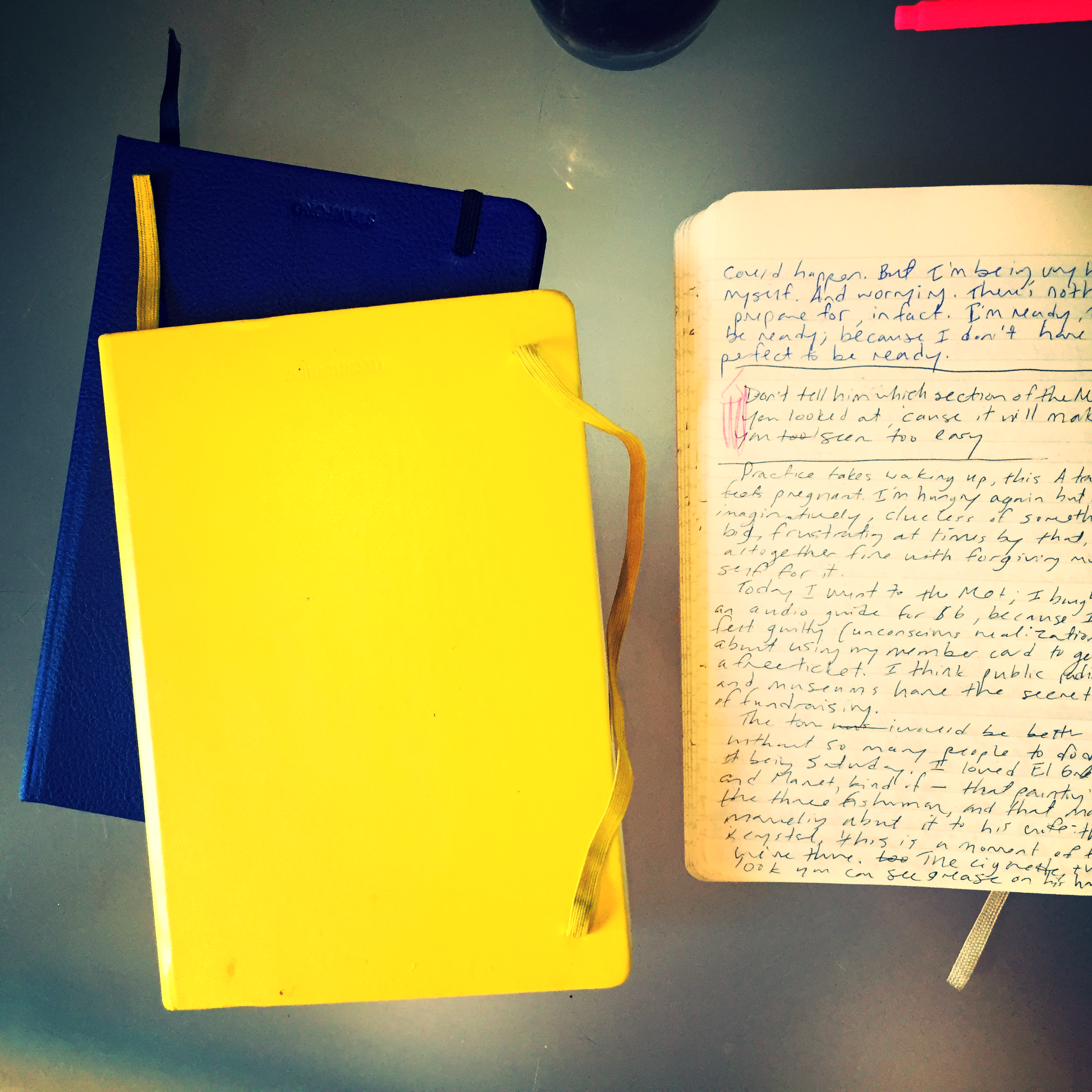
KEAGGY: After “50 SAD CHAIRS” I did a lot of other “collecting with photography” projects. I’d stumble on a theme and make dozens or hundreds or thousands of photos that catalogued a particular idea. Trees growing out of old abandoned buildings. Basketball hoops in alleys. Rust stains. Curse words. Lots of decay porn, which has become a genre unto itself. Recently in my photo collections I’ve been leaning more toward seeing everyday things in other everyday things. In February I challenged myself to find the shapes of all 50 U.S. states in the world around me and in June I collected the letters of the alphabet from dead worms on the sidewalk. People really liked the states project and were really grossed out by the worms. But what I do more and more of now is actually *make* things from other things—working with found and repurposed objects instead of simply collecting them. After so many years of working digitally I really felt the need to go analog. But the idea of appreciating—or at least considering—and/or re-using “junk” and little, broken, forgotten, ugly, ignored things is what ties most of my projects together.

The Materials Matter

Bretty Rawson

BY SARAH MADGES

I am often asked, “What are you going to do with all of those?” in regards to my ever-amassing collection of notebooks.

The tone people adopt when they ask me registers as an accusation, or a warning that they’re going to turn me in to the reality show Hoarders’ producers and stage a televised intervention. True, the amount of notebooks I’ve accumulated makes moving daunting (the journals, both blank and filled-in, take up at least four standard file boxes, and are heavy). But these bound batches of scribbles mean the world to me. Because it isn’t just the words that matter — the content ranging from teen angst to amateur poetry to higher ed revelations — but the format. The tangibility. The way the words look on the page. The way my handwriting sometimes forms tight serpentine ribbons or grows looser and larger when tipsy or tired or both.
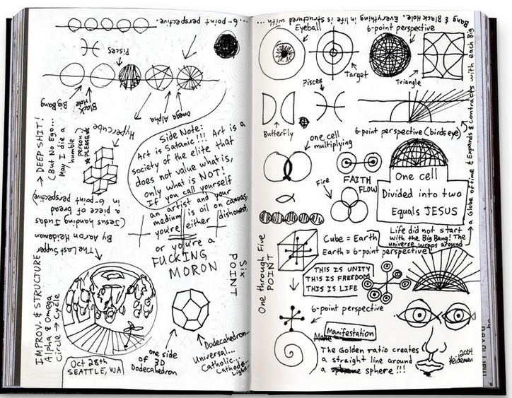
The materials matter; even the notebook choice tells a story. Moving chronologically, my notebooks upgrade in quality from flimsy composition notebooks (Harriet the Spy-grade Meads) or one-subject college ruled notebooks I also used for high school Trig, to those ubiquitous ribboned moleskines, or Germany’s analogue, the Leuchtturm, or even the notebook in which I composed this draft—a Stamford Notebook Co. lizard embossed cobalt beauty handbound in England.

The medium change means a few things: 1) I moved up one ladder rung in the service industry and could afford nicer products, 2) I was starting to take myself seriously as a writer, and each double-digit-$ notebook was an investment in that continued pursuit 3) other people were taking me seriously as a writer, and gifting me nice notebooks for holidays 4) I realized the paper quality, brightness, and thickness, all contributed to the actual look of the text.

I began to appreciate the aesthetic of each individual journal entry, independent of the actual written content. 

I Don’t Keep a Journal the Way Most Journal Artists Do • A Conversation with Brian Singer of 1000 Journals Projects

Bretty Rawson

Brian Singer is a San Francisco-based fine artist whose sobriquet “Someguy” downplays the enormously unique body of work he has produced in the last decade or so. I first discovered his work at age 15, when I stumbled across the 1000 Journals Project book in my sister’s bedroom.

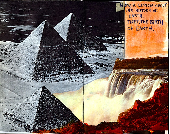
An ongoing collaborative experiment, The 1000 Journals Project attempts to track 1000 originally empty journals through their travels across the globe, accumulating stories, sketches, and photographs as they pass between friends’ and strangers’ hands. In addition to larger scale projects such as this, he creates visual art pieces that explore the layers of signification of the printed word, crossing out and redacting text in a process of mixed media décollage.

SARAH MADGES: The extensive, anonymous shared artifact network you created with The 1000 Journals Project speaks volumes about individuals' desires to be creative, without fear of criticism. Did you expect to find so many untapped talents waiting to give expression to their thoughts? Did you initially conceive of this project as a way to make collaborative art or did it just kind of happen?

BRIAN "SOMEGUY" SINGER: I think everyone is creative, but society tends to have a narrow definition of the word. Some people are creative when they cook, or garden, others make art. In the book Orbiting the Giant Hairball, Gordon MacKenzie talks about creativity—I’m paraphrasing here—he says that if you ask a room full of kindergarteners how many of them are artists, they’ll all raise their hands. Ask the same question of a bunch of 6th graders, and a few will raise their hands. Ask high school students, and you’ll be lucky to get a couple to raise their hands. So, what happens to us growing up? We begin to fear criticism and judgment of society. 

1000 journals 791_03.jpg

When the project was conceived, it was based on what people write on bathroom walls. Not quite collaborative art, but more like public conversations. That said, I love the works of Dan Eldon, and sort of imagined what would happened if people just layered and layered their contributions until you got a density similar to his journals. 

MADGES: In an increasingly tech- and text-based world, handwriting has lost some of its former relevance and ubiquitycursive is no longer even required in U.S. school curricula and thousands of people have never written or received a letter in their entire life. How important is the handwritten aspect of these journal entries to you? How important is the written word to you as an artist?

SOMEGUY: The hand-crafted element is crucial to the journals. It’s almost like a signature, or hint of a person’s personality, beyond the words written. As an artist, for whatever reason, it has a little less meaning to me. Strange, now that I think about it. Perhaps because it’s so accessible and anyone can do it, it feels less precious or unique. Or maybe because I don’t incorporate handwriting into my art work — I’ve never really liked the look of my own handwriting. It’s more like chicken-scratch, which I blame my dad for.

MADGES: Do you keep a journal?

SOMEGUY: No. Yes. Sort of. I don’t keep a journal the way most journal artists do. When I was younger, I kept a journal which was more like a diary of sorts. Now, I have sketchbooks, which I use mostly for notes and ideas. Not really for freeform writing, or artwork, just lists and notes and sketches. 

MADGES: As far as I can tell, the 1000 Journals Project was last on exhibition in Scottsdale in 2013. Where is it now? What are your plans for the project? Do you consider yourself its curator anymore?

SOMEGUY: There aren’t any exhibition plans for 1000J right now. A couple years back, I approached a few venues, and while there’s some interest, nothing panned out. As for plans, again, I don’t have any current plans. This is mostly due to time constraints, it takes a lot of energy to keep things going. I do consider myself the curator of the project, but am mostly playing a waiting game.. waiting for journals that have been out in the world for almost 15 years to be rediscovered and sent home. I imagine most are sitting on bookshelves, forgotten over the years.

MADGES: What do you think is the relationship between visual arts and creative writing? Do you think of yourself as a poet or writer when you create your cross-out and printed word pieces? 

SOMEGUY: That’s a great question, because I haven’t given it much thought. I tend to gravitate towards certain types of works. These can be strictly visual in nature, or strictly written. I think the ability to combine the two opens up the best of both worlds when done well. They can live in harmony, or in contrast, and add value to each other, or amplify the artist’s intent. When I create my redacted works, I mostly consider myself an editor. I’m stripping away information and creating new meaning. I’d hesitate to call myself a poet or writer, which might be an insult to poets and writers, but there are some similarities in our goals to shape language and message.

MADGES: What have you been working on lately?

SOMEGUY: Lately, I’ve been working on building bodies of work around themes. So not really participatory, or journal based projects. One recent explorations was around visualizing number patterns (connect the dots) in unexpected ways. And the current exploration (no photos online yet), are process based works where I put a shape on every page of a book (imagine a circle or letter), and then cut the book up and reassemble the shape using the edges of the paper. 

1000 journals cover issues 291-300.jpg

Clean

Bretty Rawson

Sarah Madges is a handwriter living in Brooklyn. Her handwriting has appeared in numerous composition notebooks, a handful of three-subject college ruled notebooks, and a whole host of moleskines. She also works with typed words, which have appeared in places like the Village Voice, Killing the Angel, and various abandoned blog platforms. 

300 Mg

Bretty Rawson

Wellbutrin blues dose high dose low so close. closet blues
keep shoes rubber made walking. white round scribbles. Avoid
avoids. Walk away stomp shoes bouncing soles black.
colorful hyphen split open particles purged beads of feel
betters scattering scattered. Extend the release of. You might
experience. May include. Talk to your doctor.
Peristaltic magic make me whole soul bouncing.
Internal tremors shake off just wellbutrin blues.
Swallow swallows swallowed shallow breathing blue-
Ing. Better better better better. Walk out old life
matinee movie — much brighter than you
remembered.  Glittering goldly sweetly scrim of
saccharine. Put it on peristaltic. Old life moth balls
closet blues forget forgot. Swallowing a white room
quiet white noise machine drown out therapy
drown out but what about tell me about talk
about I. Scratch pad for scars give coat for bag
rattling. Bouncing in bag walking out old life.
Ticking rattler reminder not quite not quite. Quit.

Sarah Madges is a handwriter living in Brooklyn. Her handwriting has appeared in numerous composition notebooks, a handful of three-subject college ruled notebooks, and a whole host of moleskines. She also works with typed words, which have appeared in places like the Village Voice, Killing the Angel, and various abandoned blog platforms.