BY INGRINA SHIEH
Urban landscapes have always enticed to me. I love how lines intersect with other lines and the way shapes within, through, on top of other shapes create the towering skyscrapers we recognise so well. At a distance, city skylines emanate a beautiful stillness and unflinching majesty while within them pulses the movement and sounds of millions of lives. People, machines, and people on machines, darting around at a frenetic pace; opportunities opening and shutting before me. It exhausts and excites me. And though I’m constantly surrounded by people, I can sometimes feel the loneliest I’ve ever felt. Such contrasts hold me captive between repulsion and absolute adoration, so I‘ve come to simply accept the city as it is: a fortress of order within chaos.
It thus seemed fitting that I design my first hand drawn 2017 calendar based on cities of the world. I don’t know what possessed me to draw it rather than design it with software, but once I got the idea, it stuck. I also thought working with cityscapes by hand might help me learn the basics of design and drawing: how to put lines and shapes together and how light hits objects at certain angles.
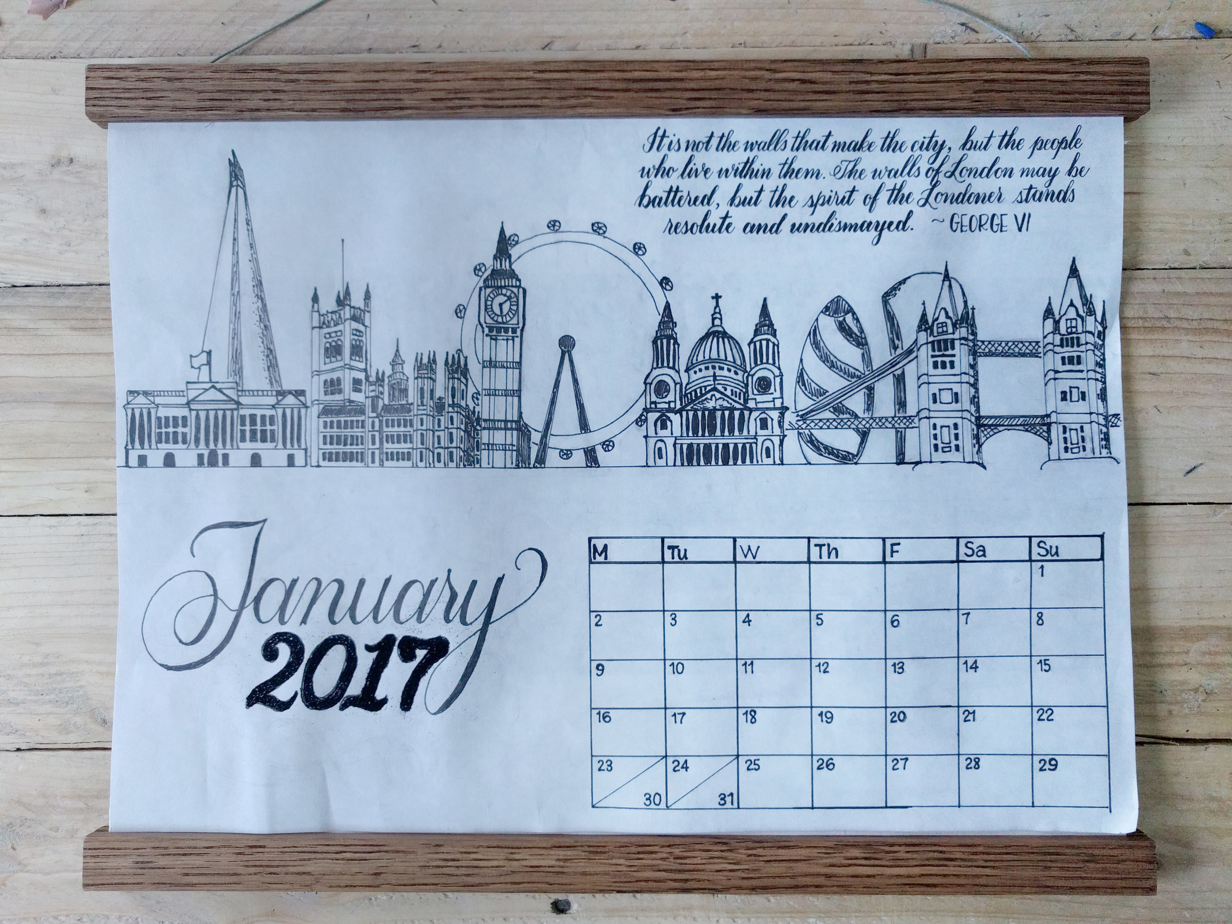
Naturally, I started off with the city I call home — London — though I had already done practise sketches with Venice and Boston. This sketch took a good deal longer and involved more ruler-ing and erasing than I’d anticipated, but two days before 1 January 2017, my shaky hands committed the sketch to ink, and I even embossed ‘2017’ for the hell of it.
As a tribute to Londoners, I added a quote by George VI: It’s not the walls that make the city, but the people who live within them. The walls of London may be battered, but the spirit of the Londoner stands resolute and undismayed. The end result is not completely what I had envisioned — a little flat, lacking in character and depth, a little boxy — and I realise that I need to upgrade my drawing pens. But this first step has provided a foundation for the coming months’ designs and further ideas to zoom into cities on a micro level.
I’m excited about interacting differently with the iconic buildings I see so regularly in person and online. In drawing London, an unexpected intimacy came from having to examine details — ornate and simple — and deciding how to transfer them to paper. When I passed Big Ben and the Palace of Westminster during my early morning run, I noticed how many elements I missed or couldn’t fit onto the page. But, by studying it as I had, I was able to appreciate its grandeur and craftsmanship more deeply and to admire the fact that, long ago, this icon was borne out of someone’s careful etchings on paper.
